Tu PLP
Exploring ways to reduce steps to purchase.

About
Tu Clothing is the largest UK clothes retailer by volume but its digital offerings sit very much within a legacy world. As a result there are multiple opportunities to redefine the user experience based on new and emerging paradigms. This project looked at the bottom of funnel journey going from Product Lister Page (PLP) through to Checkout with a focus on the transition between PLP to Product Description Page (PDP) and the amount of information a customer needs to make a confident and informed purchase.
Feature Hypothesis
Our continuing goal is to reduce friction and frustration within the shopping journey. With that in mind we wanted to test whether a PDP was superfluous for many shopping journeys if selections can be made at a higher level (Product Landing Page). Were users confident in making purchases from the PLP with the information available to them?
Sketching session part of this work (and more)
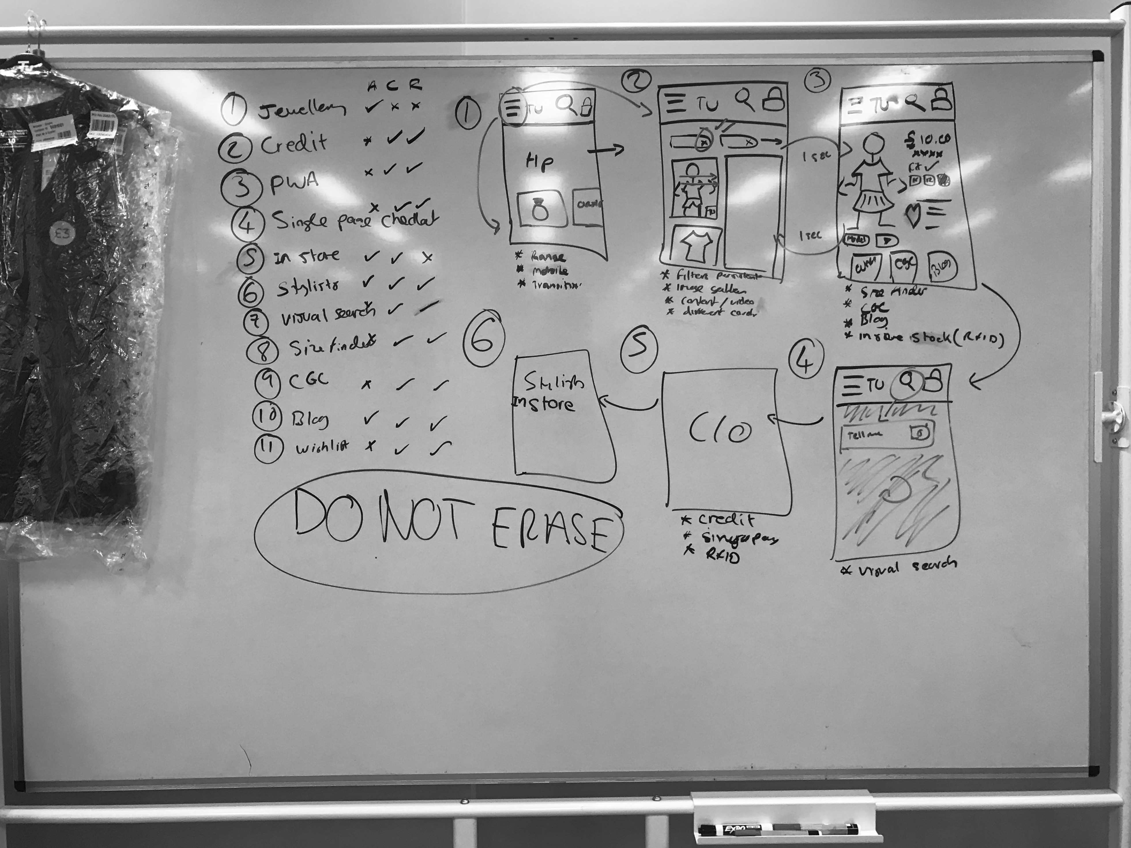
Team sketching
I ran an in person whiteboard sketching session with the PO and Lead Engineer were we sketched out possible ways to enable purchasing on PDP.
We did further sketches trying to work out what information would be needed from a user perspective and what would be possible to pull in from current PDP experience.
With reducing information (whats the least amount of information a person needs to make a confident purchase?) a few versions were mocked up and shared with the wider team for a input/review.


Current and Proposed Flow
Developing ideas
From the sketches a series of screens and prototypes were worked up to get a feel how the ideas would work with a higher level of fidelity with a focus on how much could we really fit in the small space or mobile.
Concept 1
Choose size and colour CTA, both selectable in single drawer

Concept 2
Step based mechanism

Concept 3
Tabbed expereince with supporting information

Prototypes
The chosen option was refined and built into an Axure prototype of the full journey in preparation to test. Seconday CTA's were used as we work on the theory that a there should only ever be a single primary CTA action on a page at a time for journey clarity.
There were two versions of the prototype, one with additional information in a tabbed format within the slide up drawer.
Test screens

Testing
Testing was done over a 2 day period with 10 participants (half Tu customers and half non Tu customers) in a Lab environment. The tasks subjects were asked to complete were shop for a Dress and shop for Girls socks. Our assumption to test was that users would feel they have enough information served to them via the draw that they were confident in making the purchase without the need to go to the PDP.
When asked which version they preferred when shopping for a Dress (and why), customers responded as follows:.


Results
Testing was done over a 2 day period with 10 participants (half Tu customers and half non Tu customers) in a Lab environment. The tasks subjects were asked to complete were shop for a Dress and shop for Girls socks. Our assumption to test was that users would feel they have enough information served to them via the draw that they were confident in making the purchase without the need to go to the PDP.
When asked which version they preferred when shopping for a Dress (and why), customers responded as follows:.
Next steps
The tests did not prove there was any appetite for purchasing on PLP to the detriment of being able to compare multiple products in a single view port (a behaviour we over looked) leading to…
An opportunity! Explore ways to help users compare multiple products.
The tests did demonstrate that there were no issues with users interacting with and buying from a slide up drawer mechanism which we can explore porting over to the PDP enabling a sticky CTA above the fold.

