Motorway
Customer activation journey
About
Motorway started in 2017 with a vision to build a better car market for everyone, operating in a very competitve market against companies such as Carwow, Webuyanycar and Cinch.
I joined Motorway in summer 2023 and after an “easy in” learning the way the company works on internal tools was moved over to the Growth team tasked with optimising top of funnel - in this case the first four pages a (new) user would see when landing on Motorway.co.uk with the intent of (potentially) selling their car.
Heuristic evaluation of current experience
The first thing I did when joining this team was to go through the current experience and making some potentially quick and easy optimisation recommendations, these included things such as:
✅ Making sure CTA's were visible across all viewports
✅ One Primary CTA on each page
✅ Increase Accessibility of form fields
I shared the findings with the wider team (Lead Product Owner and full Dev team) to gauge thoughts and feelings as well as get a rough idea of effort involved (from an engineering perspective).
With the whole team aligned we wrote up tickets for refinement and rolled out each optimisaiton seperatly and measuring impact.
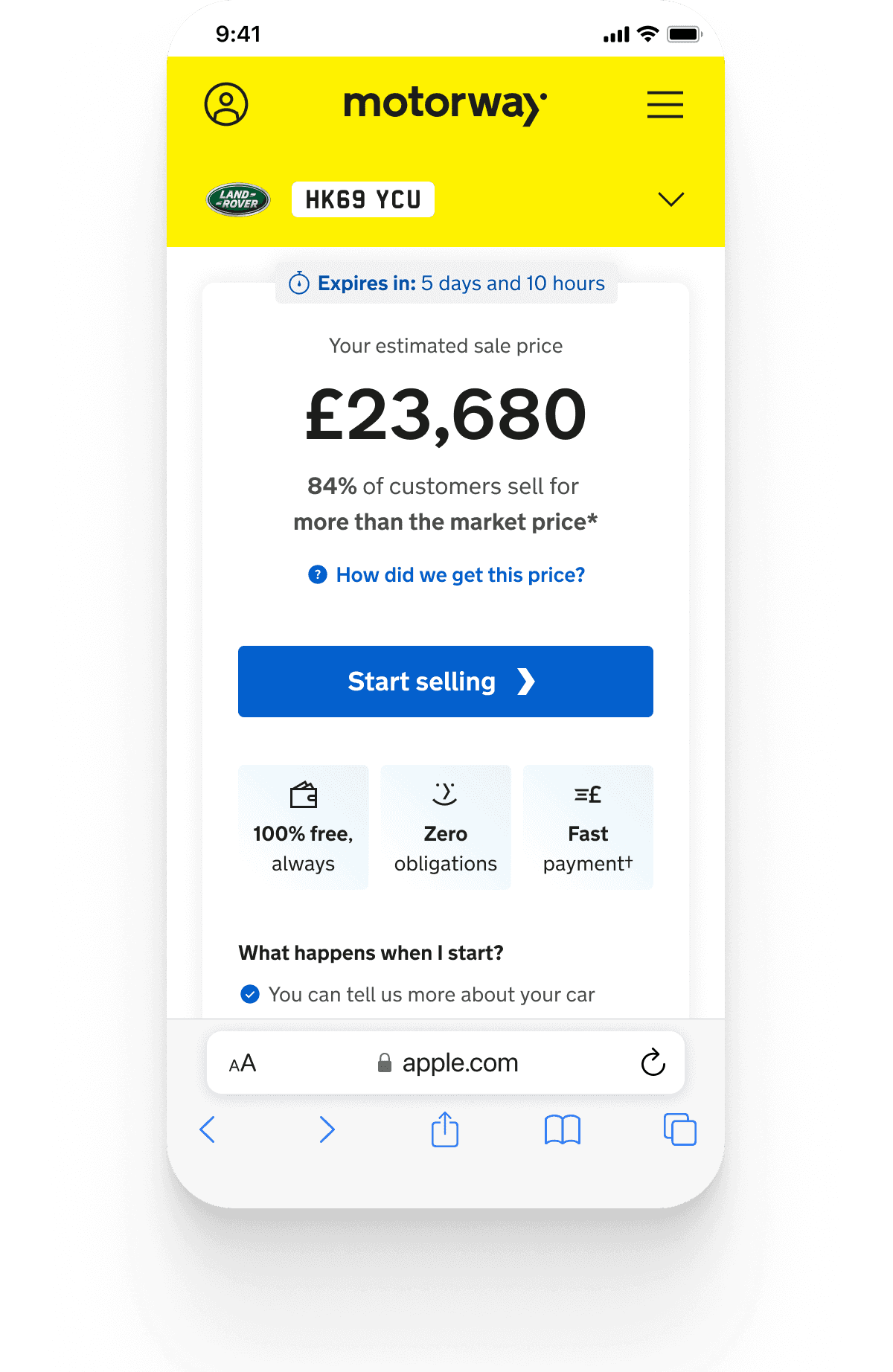
Brining Primary CTA into all Viewports on initial load
Before - Initial load iPhone 13 Mini
After - Initial load iPhone 13 Mini
Results
Each one of these changes had 5%+ positive impact during 50/50 A/B testing and was subsequently rolled out to 100%.
+6.65%
CTA in all viewports
+3.21%
CTA updates
Addition action
Off the back of this we also rebuilt the header to reduce the amount of space it took up as during User Lab testing people were aware and confident that the valuation was related to the car details they had inputed and act as an enabler for more space for more valuable content.
Page header before and after
Original Header
Optimised Header
Problem/Opportunity space
(where and why)
A previous study and continual discovery (through moderated user testing) pointed to 3 key drivers for users to sell their car to design to:
💰 Price (how much)
💰 Price (how did MW get this price and can I trust I will get it)
⚙️ Process (Understanding/Confidence in what happens next)
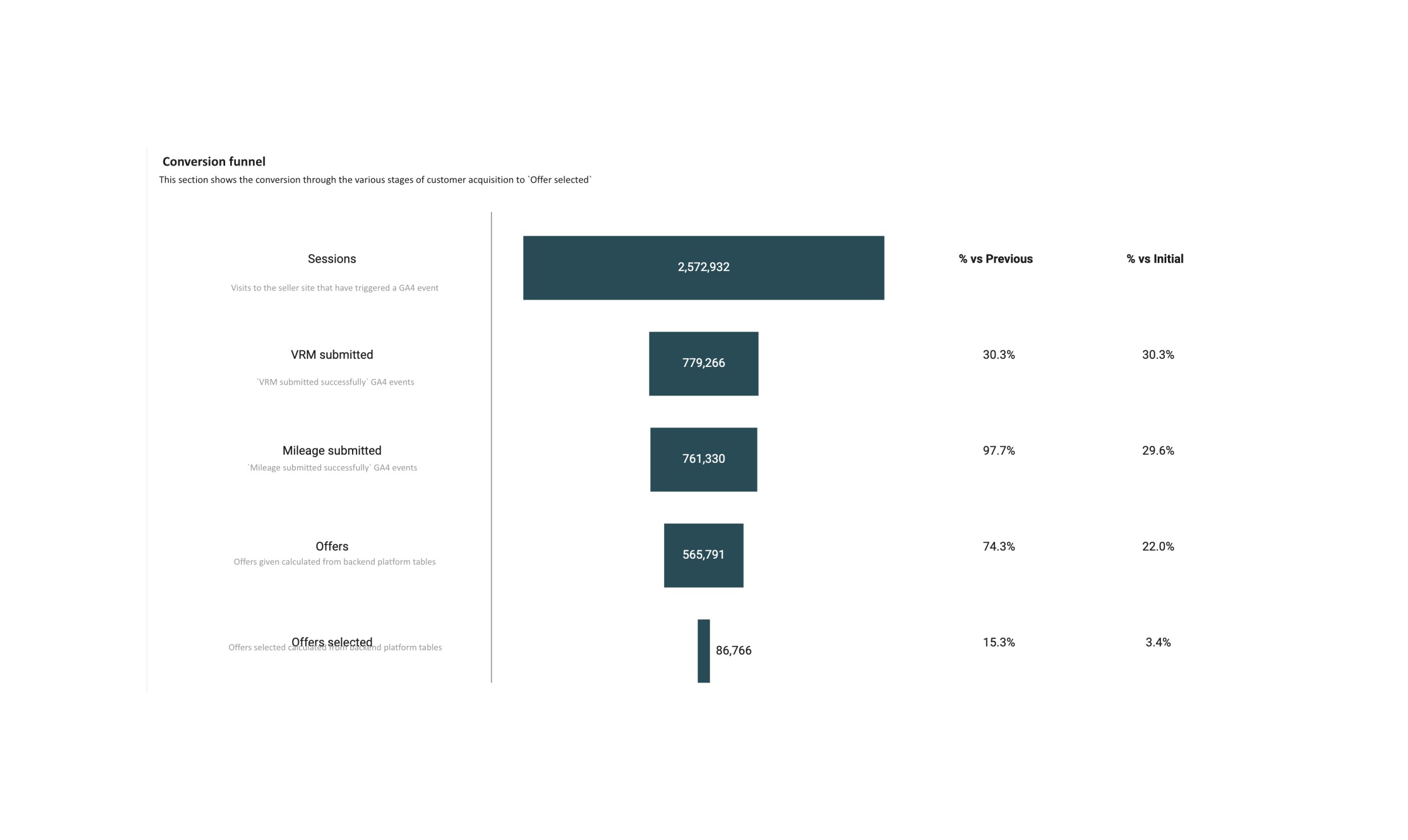
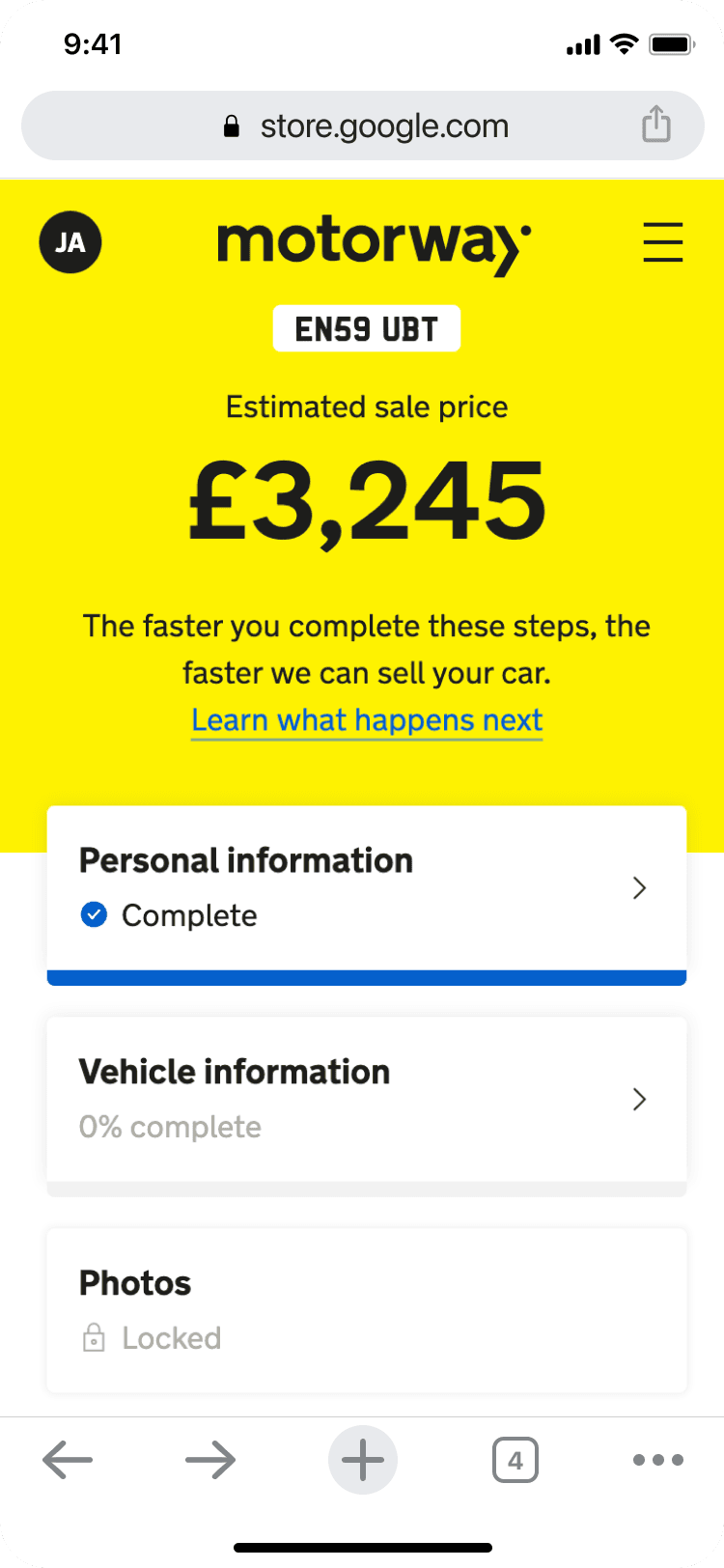
Looking at our funnel data we had two big opportunities spaces, the home page and the offer select page (offer select page being the larger of the two based on the numbers 15.3% vs 30.3% vs Previous).
The Home page had recently been fully redesigned and A/B tested on with little to no impact so there was little appetite to focus on that for now.
The funnel data
How we tackled this
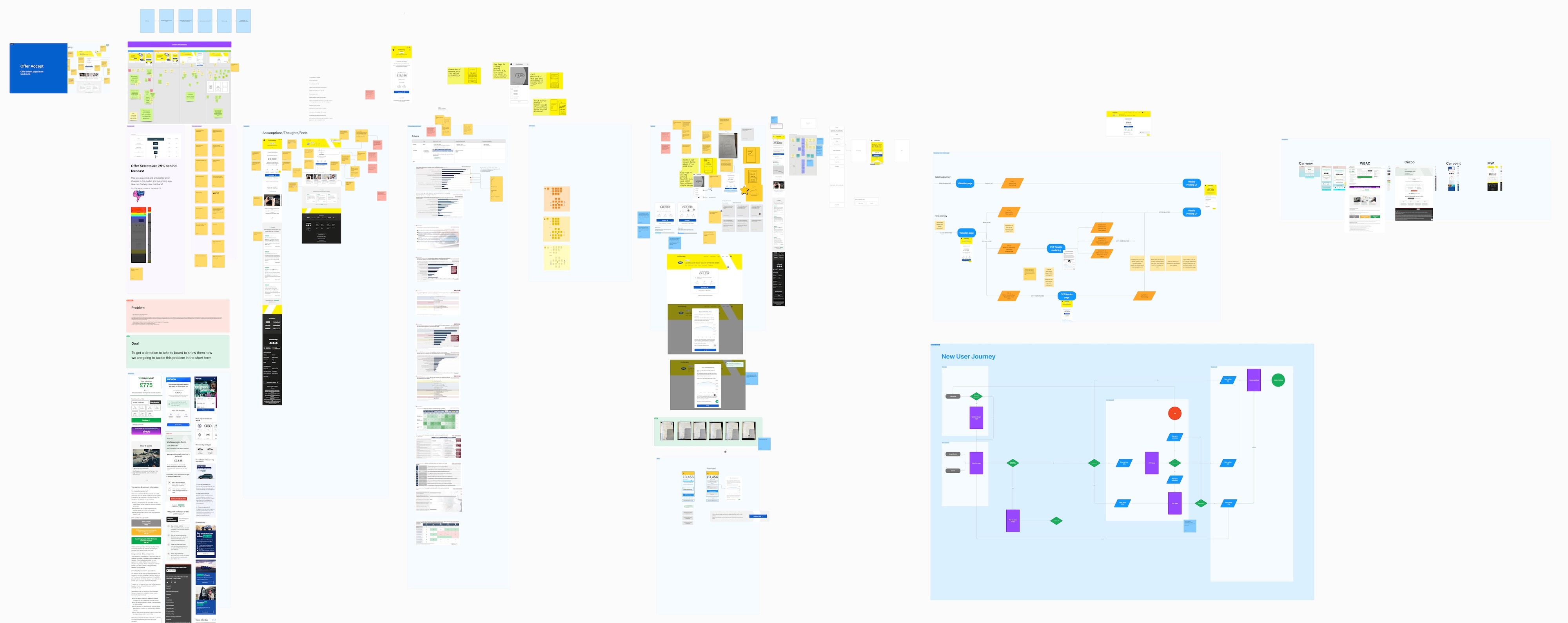
To kick this new focus off I ran a team wide workshop to pull in everyones knowledge, opinions and ideas around the current experience.
Full squad workshops
Creating a North Star
Off the back of the team workshops and research gathering sessions I started to create a North Star vision for the offer select page, focussing on why the page exists, identifying value for users, while making it achievable within a rough year timeframe.
Northstar wires
How are we going to get there?
I broke down each element of the offer select page and mapped it out to testable plan to work out our path to our North Star, validating and understanding the value of each element along the way.
Test mapping
How we got the price modal and button
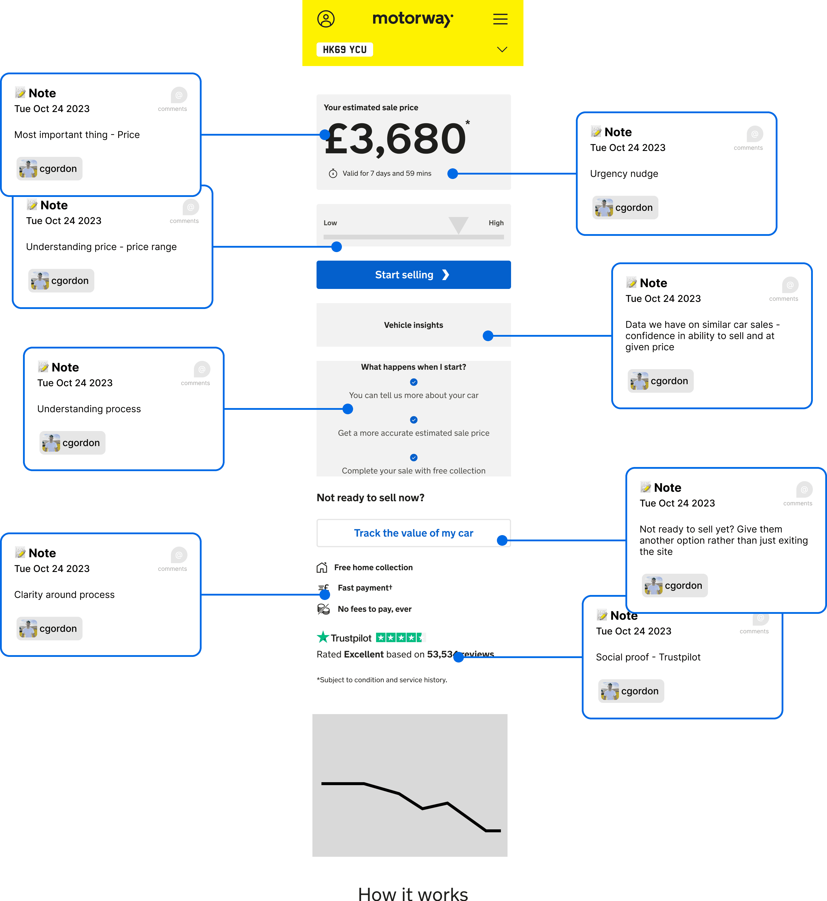
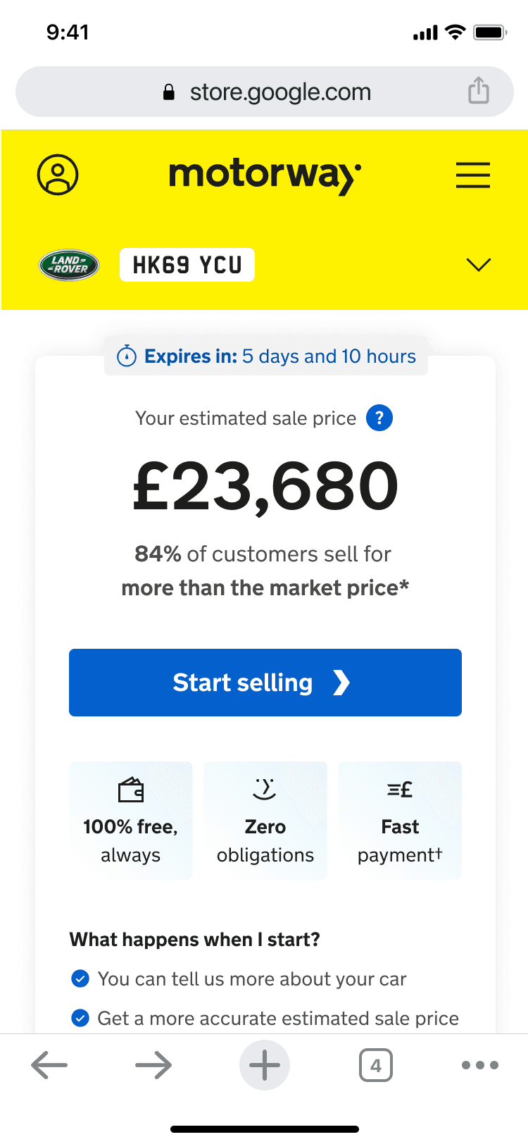
All research pointed strongly towards customers wanting to know more about how the price quoted was got (as well as questions around how it relates to their specific car).
We already had an explainer "?" but it wasnt tagged up to track interaction and also did not pass accessiblity colour contrast checks.
Hypothesis
We believe people will want to learn more about how we calculated their quote and if we build trust and confidence around their quote they are more likely to offer accept (primary KPI).
Current expereince
Current tooltip
Current modal
Back to Offer Select page
Proposed experience
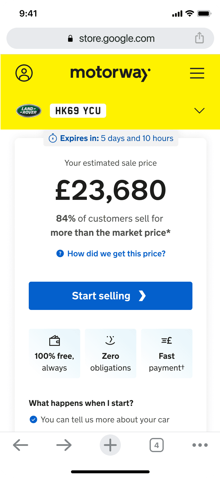
Proposed button
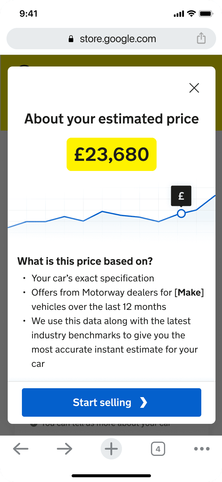
Proposed modal
Proposed onward journey
How we got there
✅ Rebuilt current experience on new tech stack to enable tacking, also make sure icon passes colour contrast checks.
✅ Measure current interaction and conversion rates on rebuild.
✅ 50/50 A/B test live and proposed.
Results
106%
Interaction rate
+10%
Conversion on interaction rate
Next
Continuing our journey towards our North Star and a whole new experience.

